Bike Fun App
2024
Created
Independently
A rider-first iOS app that helps Portland cyclists discover, plan, and enjoy community bike rides with ease.
In Portland, Oregon, social bike rides are at the heart of the city’s cycling culture. The community-run site shift2bikes.org serves as the central hub for ride listings, and during the annual Pedalpalooza festival, more than 800 themed rides take place over the summer months.
However, because the site is run by volunteers with limited resources, it offers only basic features. Rides are listed as text with addresses, making it difficult to filter, visualize, or plan logistics across such a large calendar of events.
I set out to design a mobile experience that would make finding, organizing, and attending rides more intuitive and fun.
Through informal feedback and firsthand experience, I uncovered several challenges with the existing system:
These issues caused missed opportunities, confusion around logistics, and frustration when trying to engage with Portland’s vibrant biking scene.
This was an independent project where I worked alone for the entire process. I was responsible for research, design, development, and community engagement.
To better understand rider needs, I conducted qualitative interviews during group rides. I asked participants about their habits, frustrations, and what they wished for when navigating the ride calendar.
From this, I created three personas that captured the most common user archetypes:
Because I was working solo, I took advantage of a simultaneous design–build workflow. I designed and prototyped directly in SwiftUI, iterating quickly while maintaining a native look using mostly standard iOS components and icons.
After synthesizing rider interviews, I distilled the needs of my three personas into actionable design requirements:
This step ensured that the solution wasn’t just addressing “general frustrations,” but was specifically tied to real riders’ goals.
Because I was the sole designer and developer, I skipped static wireframes in Figma and moved directly into SwiftUI prototyping. This let me test ideas in the actual environment where users would interact with them, and enabled quick in-person tests of functional prototypes. This approach was also beneficial when small group of riders volunteered to use the app during its alpha stages and provide feedback from their real-world usage.
I created lightweight prototypes of:
Since my test users were fellow cyclists, I conducted live testing during rides by asking them to plan their next ride using the prototype. Observing them scroll, tap, and sometimes misinterpret functions provided insights I could immediately fold back into the design. For example:
The volunteer-run API powering shift2bikes.org has no support for geocoordinates or search. To meet user expectations, I designed solutions within these limits:
These decisions allowed the app to deliver a polished, user-friendly experience even though the data source was limited.
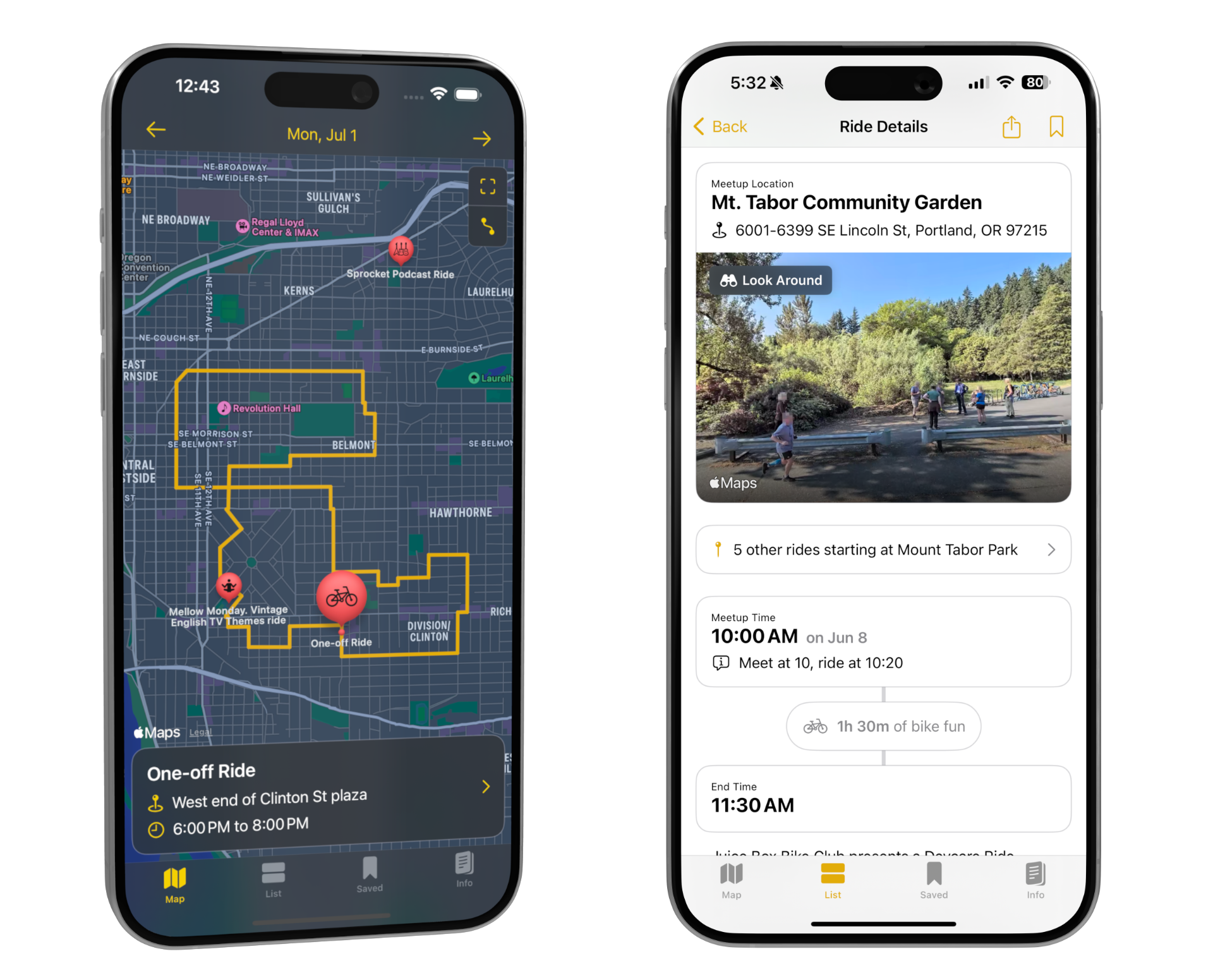
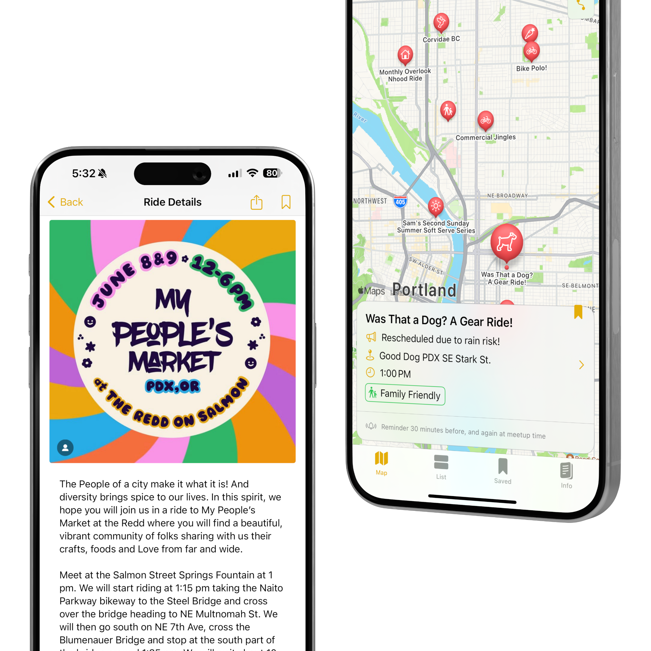
The home screen displays rides for the current day as pins on a map. I used Apple’s geocoding service to convert starting addresses into coordinates on the fly. If a ride included a linked RideWithGPS route, the app automatically detected and imported it, displaying the full planned route. This gave riders a better sense of logistics, especially when chaining rides together.
From any ride detail view, users can tap a bookmark button to save it. Saved rides appear in their own tab and support optional reminders to help riders avoid missing events.
I cached upcoming rides locally, enabling fast keyword search across titles and descriptions. The familiar pull-down search bar in iOS lists makes the feature feel intuitive and system-native.
The Bike Fun App quickly proved its value within Portland’s biking community, giving riders a more intuitive way to discover and plan social rides. What started as an independent side project has grown into a widely used tool endorsed by the very organization it was designed to support.
Key outcomes:
Beyond the numbers, the app has reshaped how people participate in Pedalpalooza and other rides throughout the year. Mapping ride start points and routes helps riders plan their bicycle outing without logistical headaches. The ability to bookmark and set reminders means participants no longer need to rely on ad-hoc notes apps. And for longtime riders, search makes it easy to reconnect with recurring favorites year after year.
Ultimately, the app lowers barriers to entry for newcomers while giving seasoned riders smarter planning tools—helping more people experience Portland’s vibrant social bike culture.
Building this app was both a technical and design exercise in solving a very real community need. Because the Shift2Bikes website is volunteer-run and resource-limited, I saw an opportunity to create something lightweight but high-impact. The result was an app that didn’t just mirror the website, but reimagined the experience around discovery, planning, and participation. This project reaffirmed for me that good UX design isn’t always about inventing something new but rather that it’s about listening carefully, understanding real-world constraints, and finding the smartest way to deliver value within them.
Future improvements I’d like to explore: