
Fifth Third Design System
2021
Created
for Fifth Third Bank
A token-based design system supporting multiple platforms for consumer and commercial products across the enterprise.
The enterprise identified that our UI components were inconsistent across platforms, across apps, and even across screens within a single app. Furthermore, flexibility for future user interface changes was limited because screens were built independently without a reusable component library. In the event that a unilateral color change across the app was desired, a developer would have to audit every single screen in the app and update each screen manually. This approach is extremely time consuming, error prone, discourages broad design changes, and results in parts of the app having inconsistent designs depending on how recently they have been worked on.
Our goal for this initiative was to establish a design system with a single source of truth that could be updated in a way that propagates changes out to all software at the bank that is built on the design system. This system had to be designed and built in a way that allows us to use the same design language across web and mobile even with differing native tech stacks and would also be capable of supporting as yet unknown platforms in the future such as in-bank kiosks or ATMs.
In order to define the problem to be solved, stakeholder interviews were conducted to identify pain points caused in the design and development process with our current methodology. We spoke with product owners, UX designers, and developers to gather this data. We used the results of these interviews to construct customer personas that defined the key results and deliverables.
Product designers told us they wanted:
Developers told us they wanted:
Product owners and leadership told us they wanted:
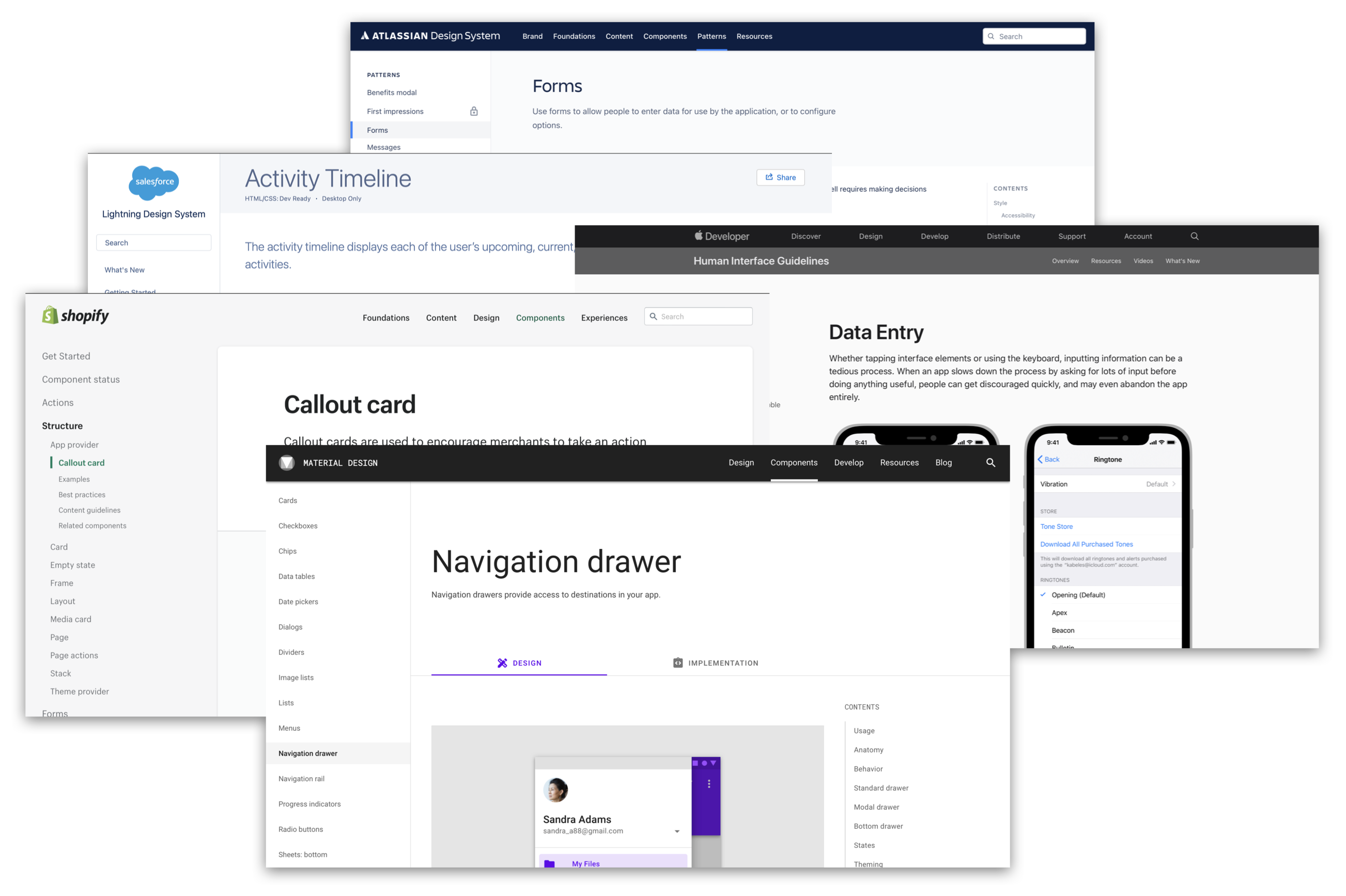
After gathering requirements from stakeholders we began to look at the leading design systems in the digital space. In performing competitive analysis we found that other banks did not share details of their design systems publicly so we mainly focused on e-commerce design systems and the design systems of leading mobile platforms. We ultimately used Google's Material design system to form a basis of our interactions and overall design language, borrowing many commerce-related elements from Shopify Polaris.

Designers consuming the design system needed a solution that would enable them to focus on the job to be done by the application without having to get bogged down by considering the visual style and behavior of the various UI components. Designers also needed clear guidelines for how to use each component and a library of flexible design patterns.

The time of a front end developer is best spent on business logic, so the design system needed to reduce their responsibility for ensuring that the visual styling and behavior of interface elements matched the UX mockups. Developers also needed the flexibility to build things that hadn’t been predicted by the design system and the ability to still benefit from the design system even for edge cases that might conflict with the design system’s goals.

It was identified that there was an inherent inflexibility and high cost of maintenance to our current approach of delivering user interfaces. There was then a strong appetite for a solution that would reduce that cost while addressing issues with inconsistent interfaces and allowing for flexibility in the future.
I served as the tech lead, design manager, and product owner for the squad. The squad also includes head count for a UX designer, a web developer, an iOS developer, and an Android developer. During the initial component buildout the squad was augmented by two web developers and three mobile developers to accelerate delivery.
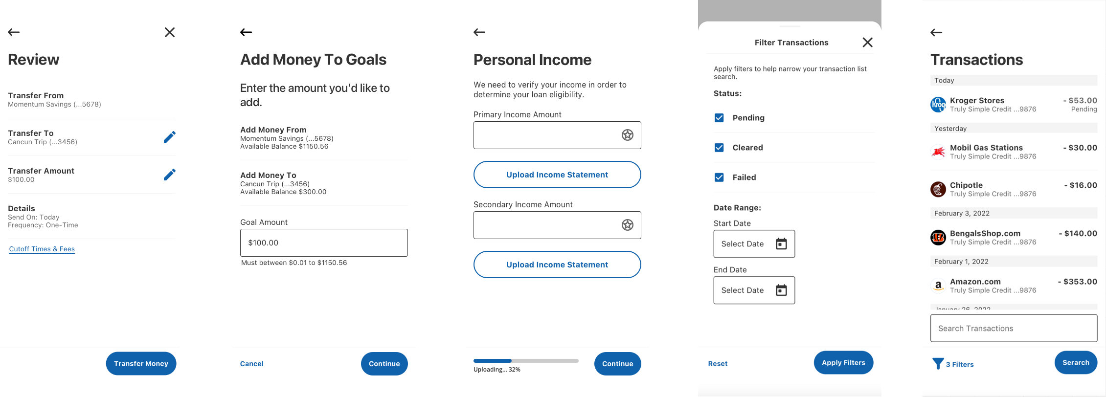
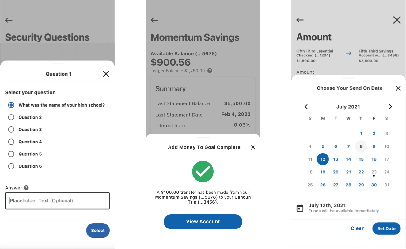
Design component library of symbols was developed in Sketch and distributed with InVision Design System Manager. Style Dictionary was used to store token declarations that define key aspects of components such as color, sizing, spacing, layout, and text styles. Native components for mobile were developed in UIKit and SwiftUI for iOS, and Kotlin for Android. Web components were developed using Storybook and PrimeNG.
The overall design system architecture can be broken into three layers: a token layer that describes fundamental design aspects of each element of the components, a component layer that consumes design tokens to determine its configuration, and an optional “local” design system layer that can extend the core design system to accommodate use cases specific to an app, framework, or platform.
In structuring the design system architecture it was also important to consider the realities of enterprise scale software development and accept that the design system could not and should not cover every possible edge case of every application in the bank. Hooks are provided strategically at specific levels to allow higher levels to extend or override the design system to solve edge cases while minimizing the code they have to own in order to do so. This approach allows edge case problem solving while separating concerns so that customizers of the design system can still receive the benefits of the lower layers without the lower layers needing to be aware of their customizations.
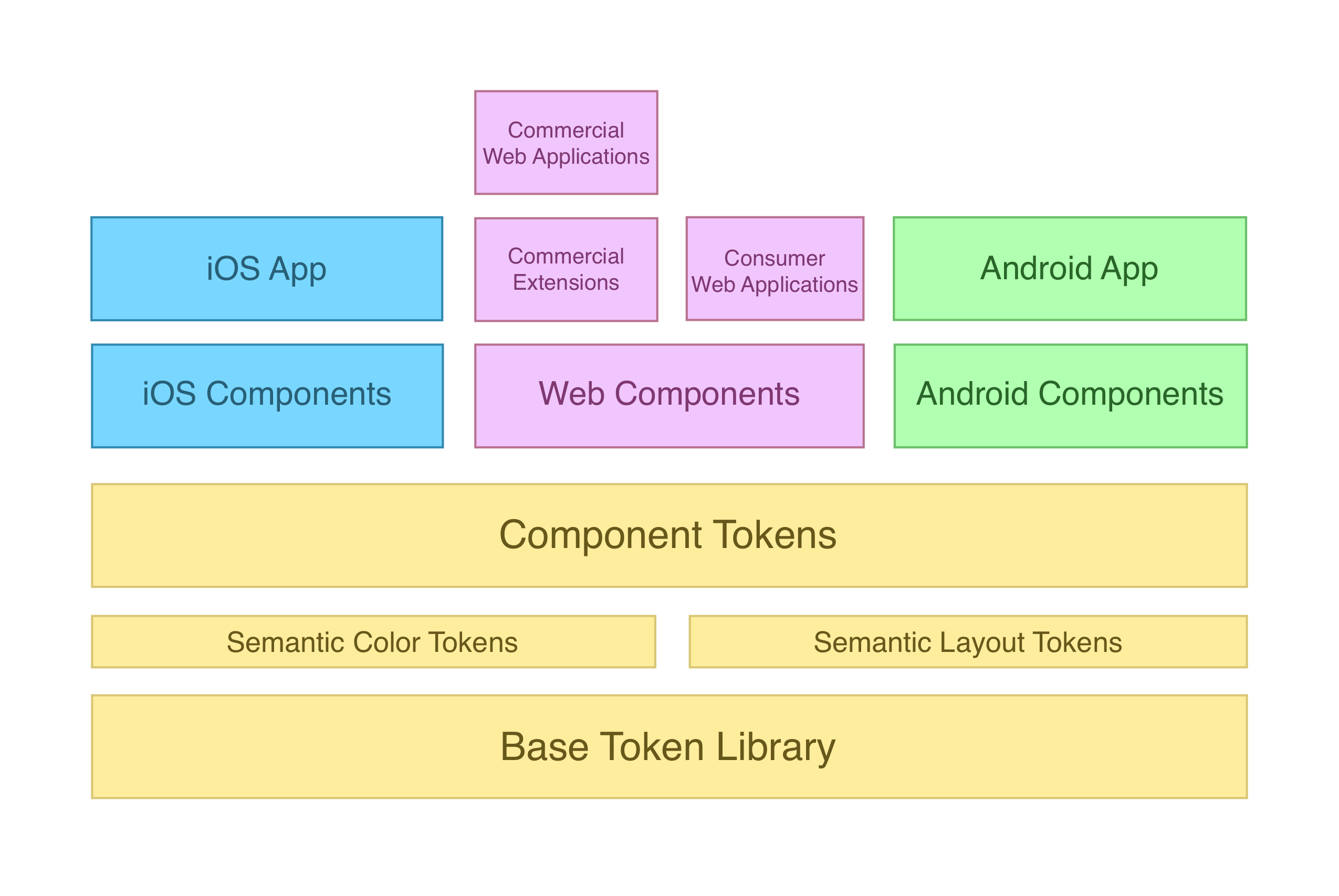
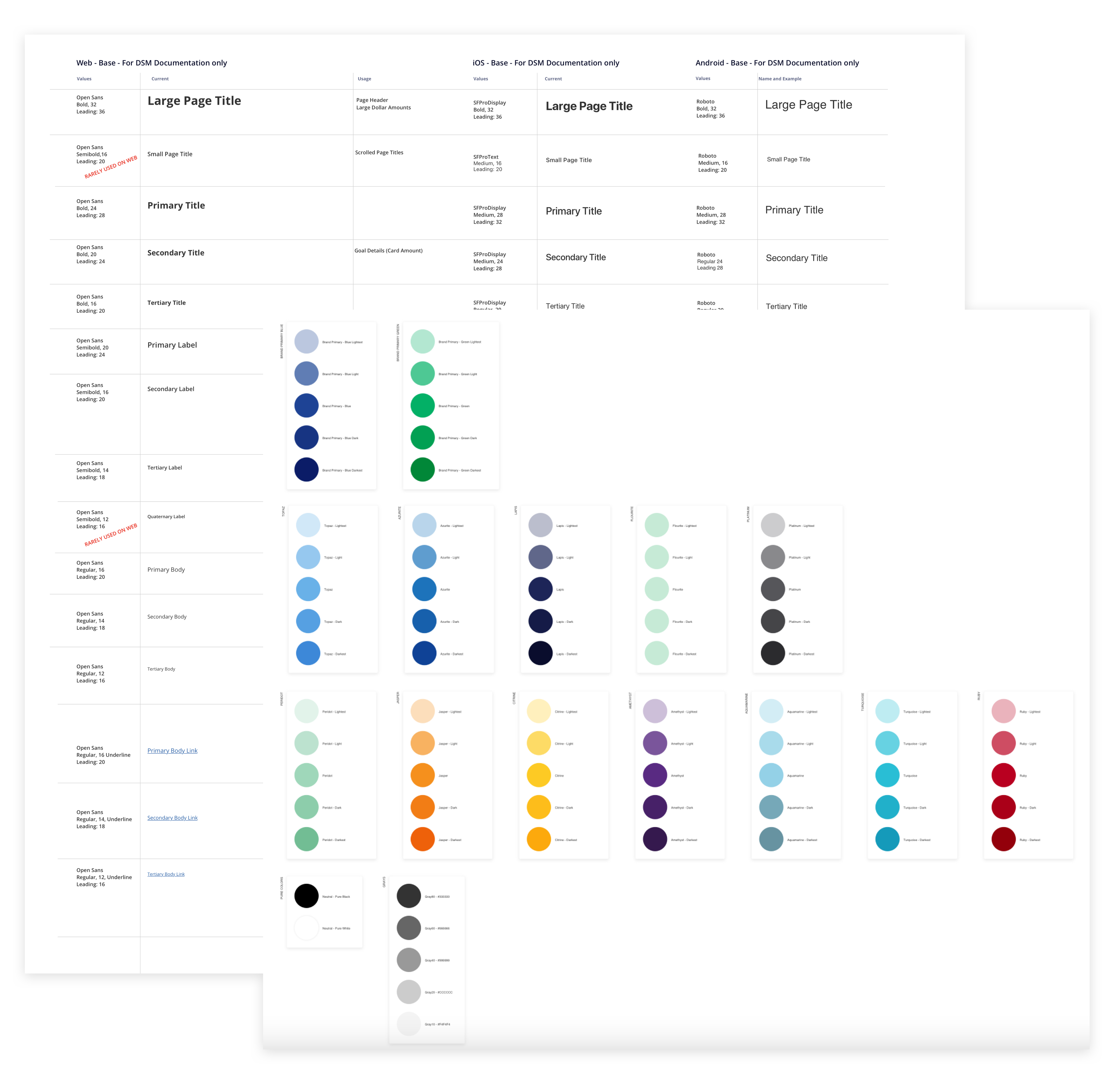
Tokens describe the fundamental design aspects of each element of a component. In addition to being an element of the software architecture, the token layer acts as a foundation for the visual design of the entire design system to help ensure consistency. Below is a non-exhaustive list of what can be defined at the token layer.
Base tokens describe the most fundamental values that are used to build up to more complex token declarations. Layout tokens are base 2 for easy scaling and all color tokens are actually composed of multiple values that include light and dark mode and high contrast light and dark mode to support system accessibility features. These values are immutable and exist only as a pool of basic values from which to reference when building semantic token collections.
Semantic tokens get their name from the fact that they are declared according to how they are intended to be used and the underlying value is left deliberately abstract. Many semantic tokens may in fact have the same underlying value but the semantic naming means that they are used in the same way each time. This structure means that when the underlying value of a semantic token is changed it is predictable how the modification will propagate out to the design system components and its consumers. Semantic tokens are intended to be consumed by the component token layer, but can also be consumed directly by designers and developers who are creating new solutions that have not yet been or never will be incorporated into the core design system.
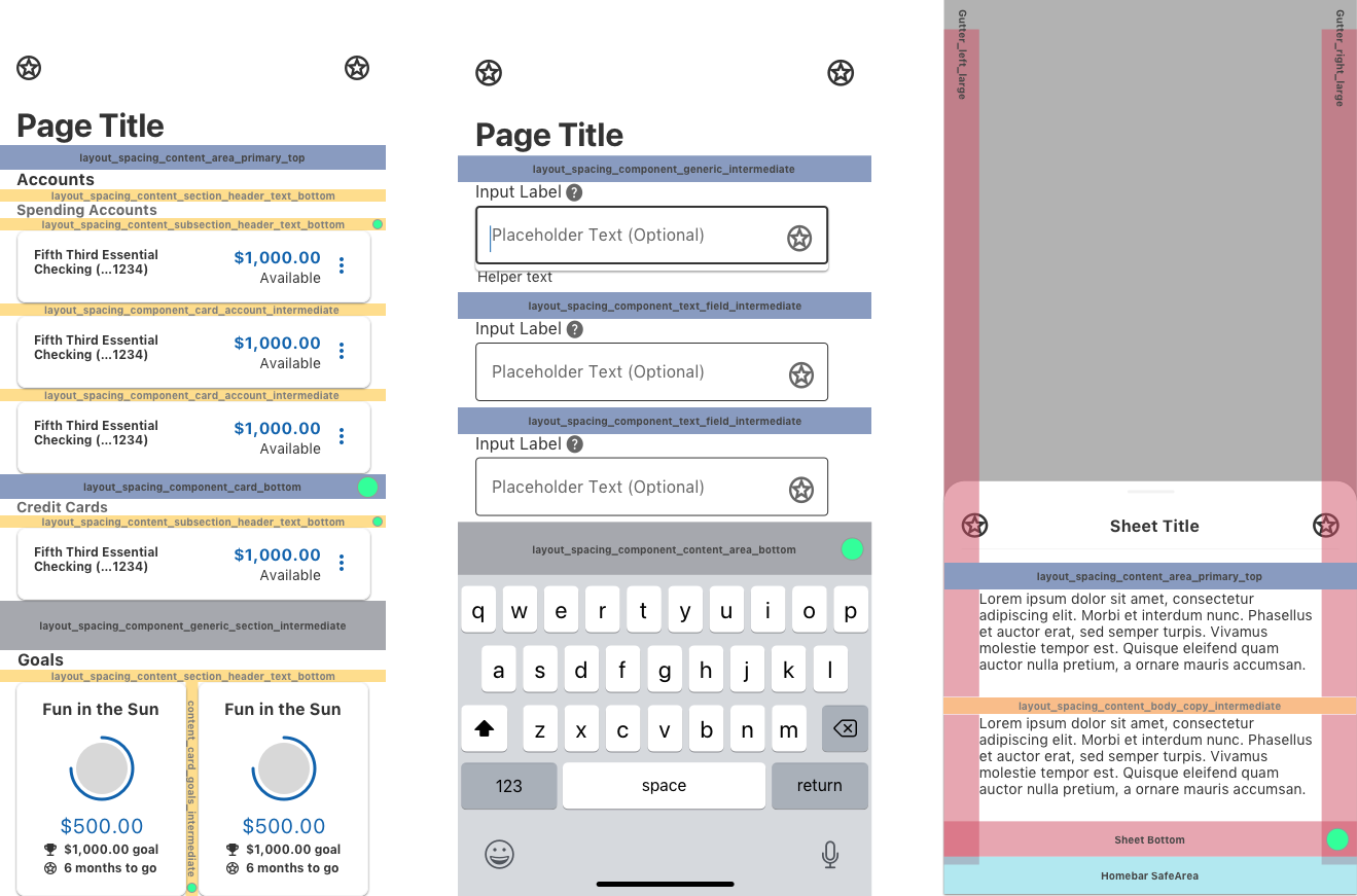
Semantic layout tokens establish standard spacing values between components. These tokens make the transition from design to development smoother by giving developers predictable values to use when building a layout instead of having to inspect spacing in prototype mockups. A small selection of semantic layout tokens are listed below.
Semantic color tokens define the color palette of the entire app and can even be swapped entirely to “skin” the app with a different style. The semantic color token layer also provides hooks for higher levels of the design system to strategically override specific colors if needed and achieve predictable results that don’t affect unrelated elements.
Component tokens consume the semantic token layer and declare the layout, size, and color of all of the elements that make up each component. These tokens are privately used by the native design system components on each platform and are not available to developers above the component layer. Component tokens are first declared globally and generically describes the component in a way that is platform agnostic. It is also possible in this layer to extend and override component tokens to provide different values for the same token or additional tokens on different platforms in order to account for the inherent differences between iOS, Android, the web, and other future platforms.
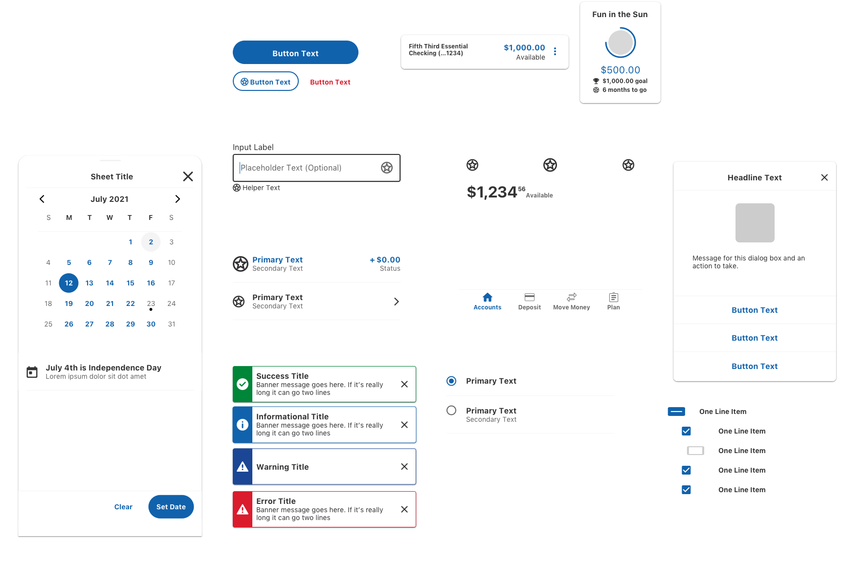
The component library for each platform consumes the component token layer and implements the component using the native UI framework. Using a native UI framework for each supported platform helps to ensure reliability and due to the token layer we can still achieve a consistent look and feel across multiple platforms without requiring a third party UI framework like React Native.
The local layer of the design system can contain components and tokens that are not used across all apps, such as custom components that are used by only a specific app or brand. Components at this layer may inherit from the platform layer and override or extend the inherited component to change or add functionality as needed. This allows the core design system to remain relatively lightweight while still being able to support a large breadth of use cases and business requirements in a large enterprise environment. Because the design system was built with extendability in mind this layer is able to act as a multiplier of the design system’s power instead of a frayed end that loses the control and consistency benefits of the overall
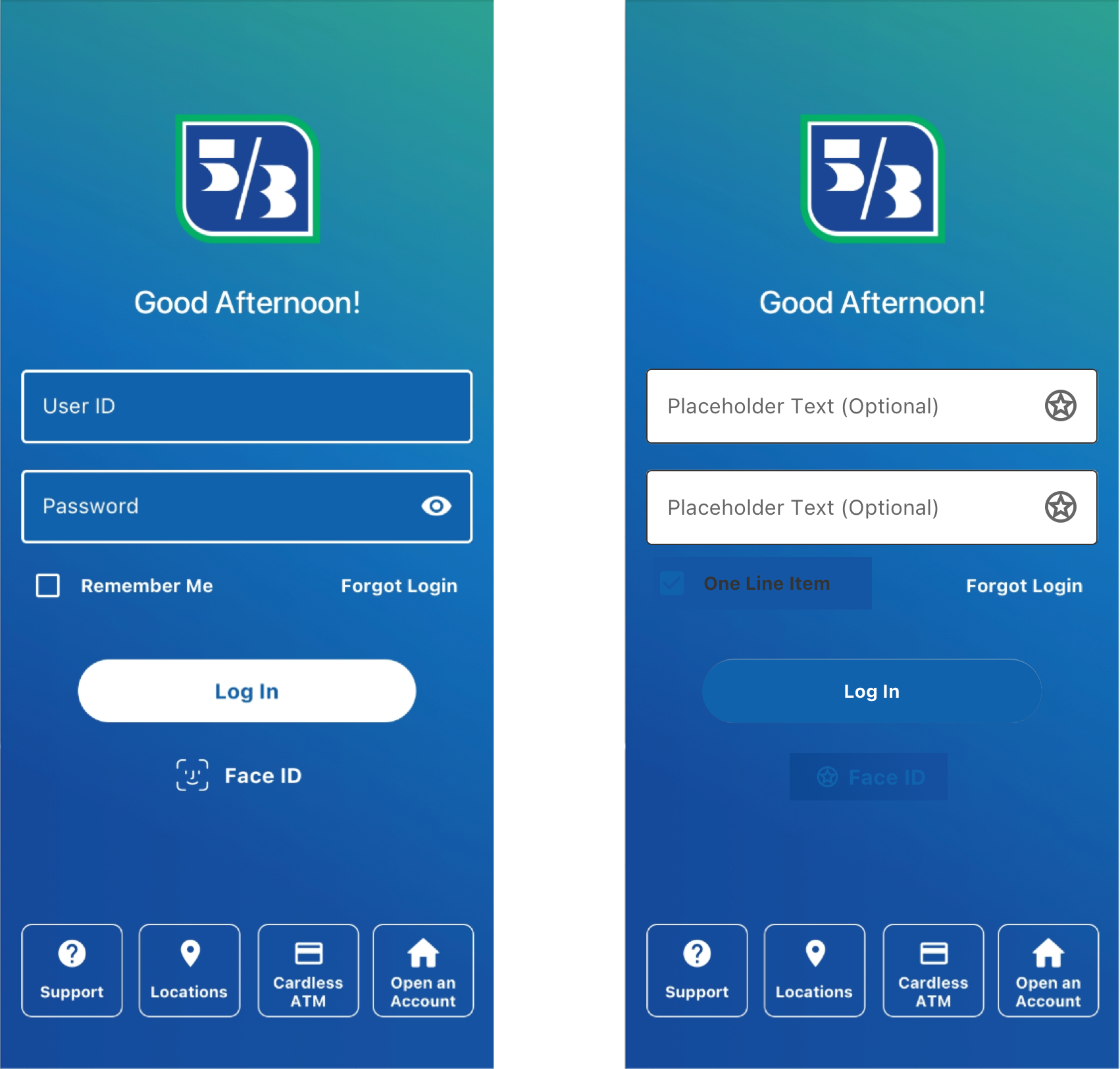
The bank wanted to have special branding for the login screens that did not work with the standard visual theme of the application. Developers on this screen were able to use standard design system components and override only the colors to force a “dark mode” theme only on this screen. This allows them to still receive non-color design updates to these components while allowing the design system to stay lightweight by only officially supporting one active theme at a time.
The commercial banking arm of the business needed a superset of components which included all of the basic components in the design system for web but also needed additional categories of components for displaying and interacting with the large and complex data sets that are specific to the use case of commercial components. Commercial developers were able to inherit the base component library and with the guidance of my team they designed and built an additional library of components on top to solve their specific use cases. The commercial specific components inherit their styling and basic interaction from the core component library so they are able to maintain a consistent look and feel and automatically inherit design updates as the component library evolves.
The design philosophy of the component library have similar goals to the technical architecture:
In order to achieve these goals we implemented an atomic design methodology that considers the basic building blocks of a component such as labels, inputs, and buttons, and combines them to build increasingly complex molecules and organisms.
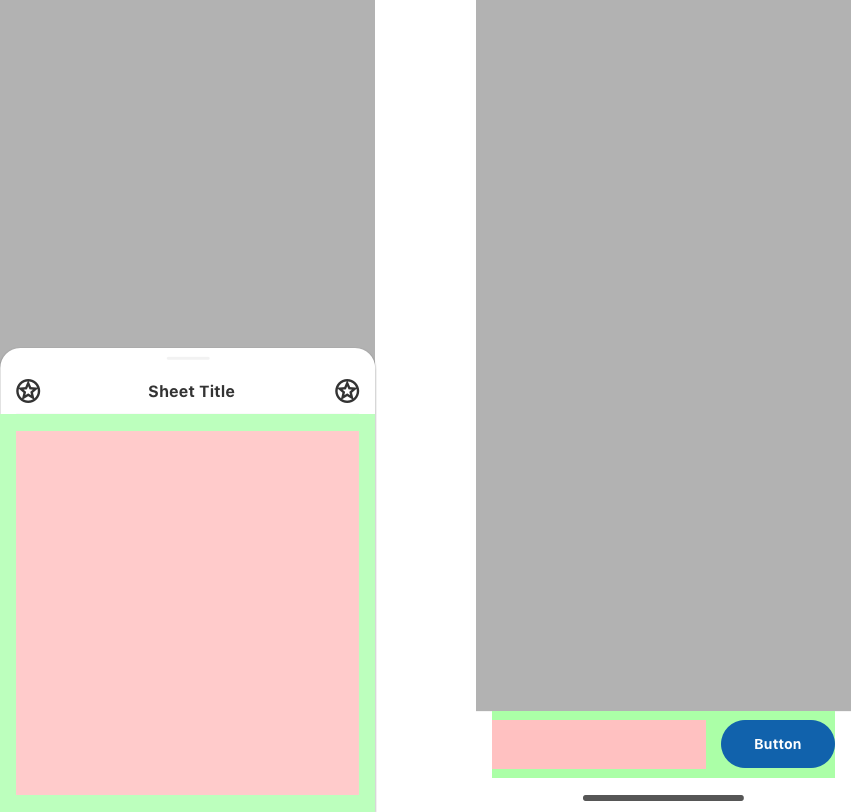
When designing components we deliberately added “pattern areas” which are contained spaces in a component that can be used to lay out any combination of other design system elements to solve a need for the given screen. We use an approach borrowed from the software development process to establish “contracts” that guarantee specific strategically placed areas of the interface will be unused by the core components, thus allowing for flexibility that goes from initial design through to production while being able to stay compliant with the rest of the design system. When creating these solutions the design team collaborates to establish a specific solution as the preferred method for the given design problem and documents it to inform future designs. If use of the pattern is common it can be developed into a dedicated variation of that component.
Once the number of beta components available to developers reached a critical mass there was a surge in adoption that was difficult to keep up with for our small team. As with any beta software there were bugs and edge cases that we hadn’t anticipated once it was being used and we had to balance addressing these backlog items while maintaining momentum for new component development. I scheduled regular prioritization meetings with product owners to form a consensus of what my team should work on for each sprint to resolve issues that were blockers for their teams.
Modifying the design system as the business needs changed required establishing a method of intake for requests and a way to decide whether and how they should be integrated into the larger design system. Weekly component proposal reviews were scheduled for this purpose where a designer could propose a new component, a variation of an existing component, an update to an existing component, a new pattern, or an update to an existing pattern. Designers were asked to show their work in a Miro board with an attempted iteration using the existing design system and their proposed updates, as well as demonstrate how their proposal could or could not be used for other use cases. Designers rated their proposal based on their confidence that the user could interact with the component without issues and the risk of getting it wrong which determined the level of usability testing and vetting required going forward.
The Fifth Third Design System was a massive project that was tasked with supporting the entire enterprise and as such was designed to be flexible an extensible with the knowledge that we could not expect to predict every possible need or use case in the bank. A robust collection of base components were provided and a powerful design token system served as the foundation to give consumers of the design system the power to solve new problems when needed without being constricted by a rigid system.
Development of the iOS and Android apps began before the design system was off the ground. In the absence of a full library of components ready to use we instructed developers to only focus on achieving functionality and not visual styling, though in many cases it was a requirement that developers be able to show something that looked final for demos even when components weren’t available. Once the full component library was available and mostly adopted it became difficult to tell where “fake” components were being used without a costly code audit. Not addressing these design system adoption gaps could lead to reduced flexibility and increased tech debt in the future.
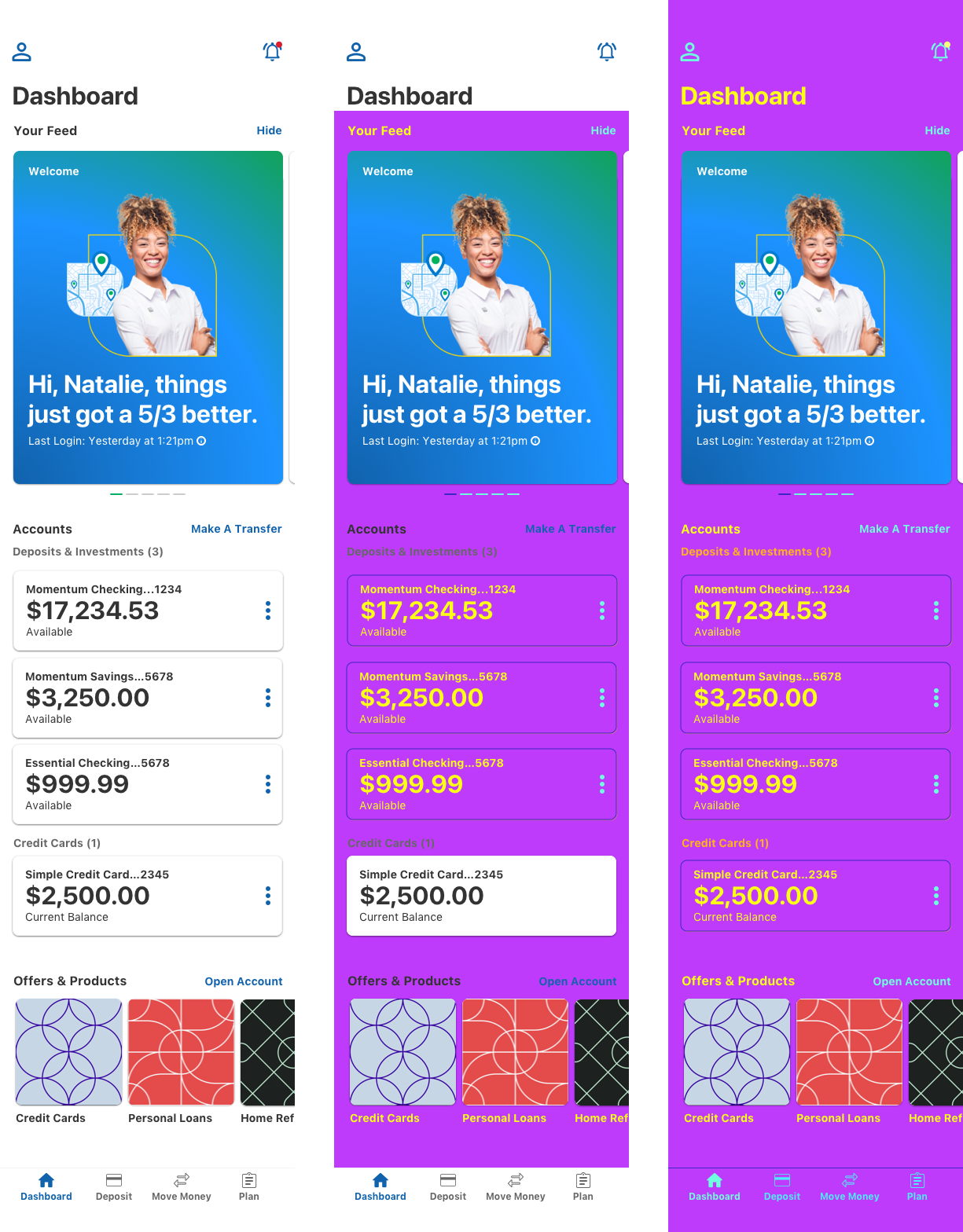
To address the issue of component gaps the design system team swapped out our semantic color token abstraction layer with a completely different color palette dubbed “Miami Vice Mode” for its bright 80s style coloring. Because Miami Vice Mode only affected design system components it would be extremely obvious where the design system wasn’t being used because the colors wouldn’t change on those elements. The Miami Vice Mode palette was available in development environments and the internal beta app for a period of one month allowing squads to quickly inventory their screens and identify design system adoption gaps to add to their backlog, saving the company thousands of developer hours that they otherwise would have spent doing code audits on every screen.
After the Miami Vice Mode period the Cincinnati Bengals made it to the Super Bowl for the first time in decades and with the approval of leadership we used the same technique to reskin the entire internal beta app with the official Bengals team colors as a moment to surprise and delight the entire organization, a fitting celebration for the official sponsor of the team. The off-cycle theme release to the production environment was executed in only four hours from the initial idea.