
Lifty Workout Tracker
2019
Created
Independently
A tracker for weightlifting workouts designed to respect user privacy and assist with progressive overload.
Working out is can be a sensitive activity with different expectations and related emotions due in part but not limited to the user’s physical fitness level, gym experience, sex and gender expression, or style of workout. Lifty aims to create a safe place for anyone to perform a weightlifting workout their own way without being pressured to perform in a specific way and with the confidence that their workout and health data remains privately held. Furthermore, many workout apps tend to be bloated and cover every type of workout that someone might perform. Lifty limits itself to traditional strength training exercises and does not complicate the interface with attempts to teach the user exercises or guess the routine that the user wants to perform.
Lifty was primarily designed to provide a low friction path to recording workouts without requiring the user to plan a routine ahead of time, and without prescribing the workout to the user. After the initial workout is complete, Lifty makes it easy for the user to track their progress when performing that same routine again. Lifty’s secondary goals were to respect the user’s privacy by storing all workout data on the device itself and limiting any analytic collection by making them completely optional, explicitly opt-in, and ensuring that collected analytical data could not be used for advertising purposes.
A competitive analysis of other popular workout apps for iOS was launched to understand the landscape of these apps and what problems had not been solved by the existing landscape of apps. Many of the most popular apps were geared towards absolute beginners, attempting to not only record their workouts but to plan the workouts for them and even teach them how to perform the exercises. None of these apps had done a great job of providing useful workout programming for anyone but an absolute beginner. Attempts to integrate functionality to teach the user how to perform exercises was less effective than a coach or even a youtube video and had the effect of dramatically increasing UI complexity. It was determined that there was a gap in the market for users who were self guided on workout programming and exercise technique and wanted a lightweight app to record their workouts that didn't enforce a specific structure or workout methodology.

This user is still relatively new to weightlifting but has figured out the basics and become comfortable in the gym, and they're ready to start more closely measuring their progress in order to break through the plateaus that occur after the novice weightlifting phase. They learn most of their exercise knowledge from online resources like YouTube or strength training enthusiast forums. They appreciate flexibility in their workouts as they are still trying to figure out their favorite way to strength train and they don't want to be forced into a rigid program dictated by an app. While this user has started to feel comfortable being in the gym, fitness in general may still be a sensitive area for them and they may sometimes feel self conscious. They don't want their workout information to be visible to anyone but themselves.
Key results for the self-guided intermediate:

The gym veteran has been strength training for years and has their workout programming dialed in, they may have had professional coaching already and do not need assistance with workout programming or learning new exercises. They know exactly what their routine will be before they even go into the gym and they perform the same handful of routines repeatedly to slowly make incremental strength gains over time. They want an app that will let them easily see how their current workout performance compares to when they did the exact same routine last week, ideally in real time to make sure that they are always increasing either sets or reps, and they know that at their current level of fitness a 2% gain is something to celebrate.
Key results for the gym veteran:
This was a solo passion project. I served as the designer, developer, and project manager. Furthermore, I explicitly chose to use as little third party code as possible. The only third party code included in this project is the RevenueCat framework used to verify in-app purchases, and a heavily restricted version of Google’s Firebase framework used for collecting analytics.
Interface mockups and graphic assets were created in Sketch. The app was developed in Swift and UIKit using Xcode. Core Data was used for data storage and UIKit Dynamics are used in key places of the experience to add delight with interface elements animated by real time physics simulations.
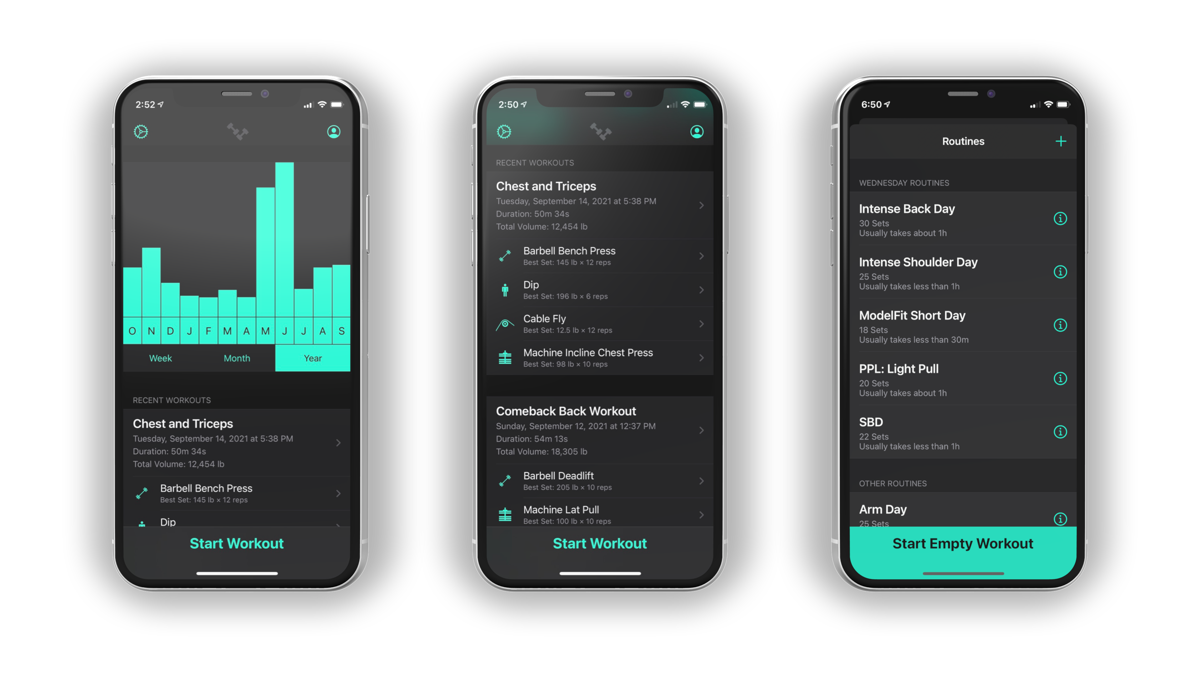
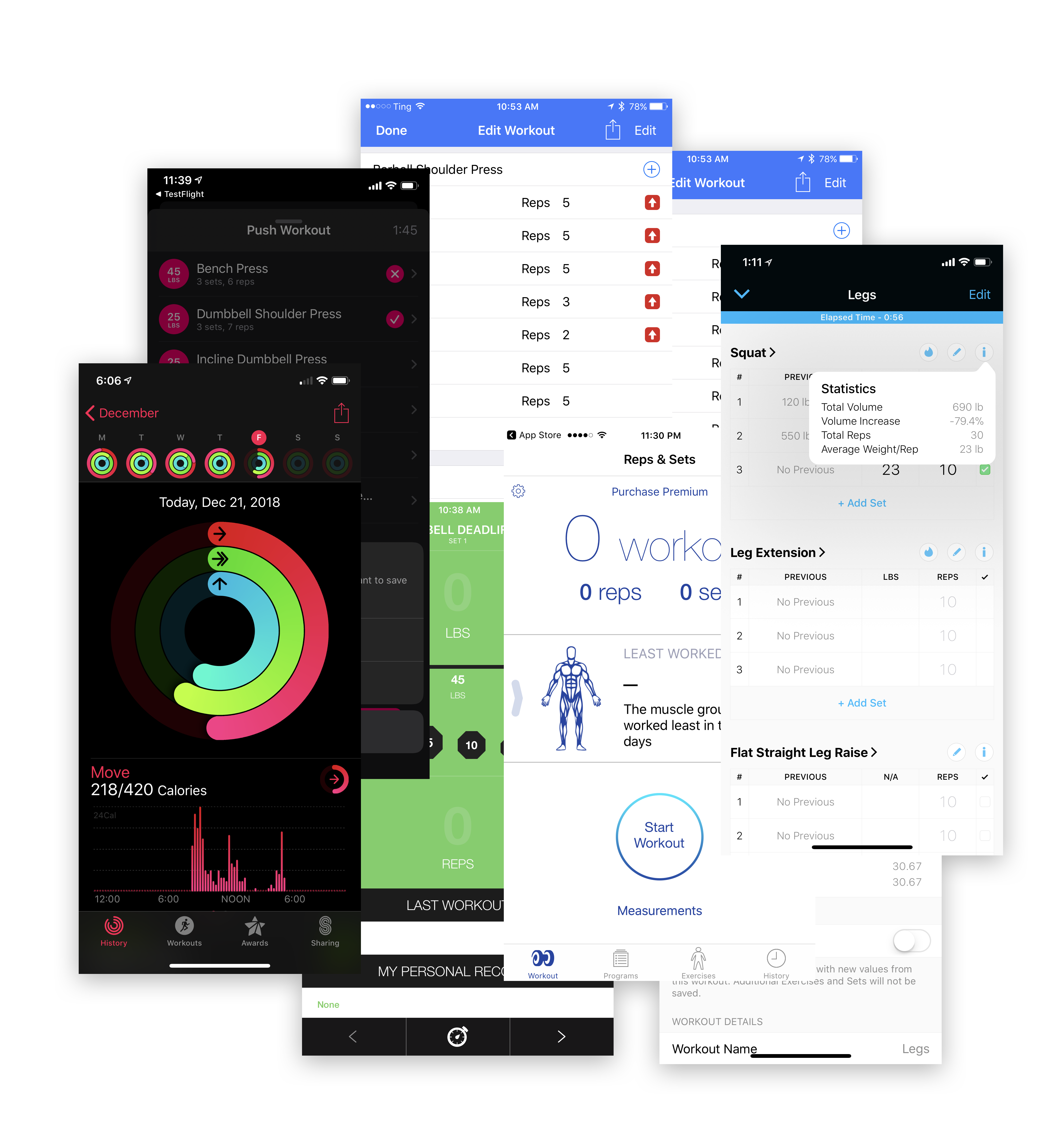
The dashboard is designed as an entry point for the application that shows the user several levels of detail of their workout performance in the recent past or over a longer period. The graph at the top provides a quickly digestible overview of total workout volume over time and can be toggled between three time periods to compare recent progress with overall historical progress. If the user scrolls down they find recent workouts displayed in a list below with details about the overall performance of the workout, the exercises performed, and their best performed set of each exercise. A clear call to action at the bottom of the screen asks the user to start a new workout, and when tapped displays a list of previous routines with the routines they are likely to repeat that day floated to the top, or a clear CTA to start an empty workout which gets the user into workout mode as quickly as possible without minimal cognitive load.
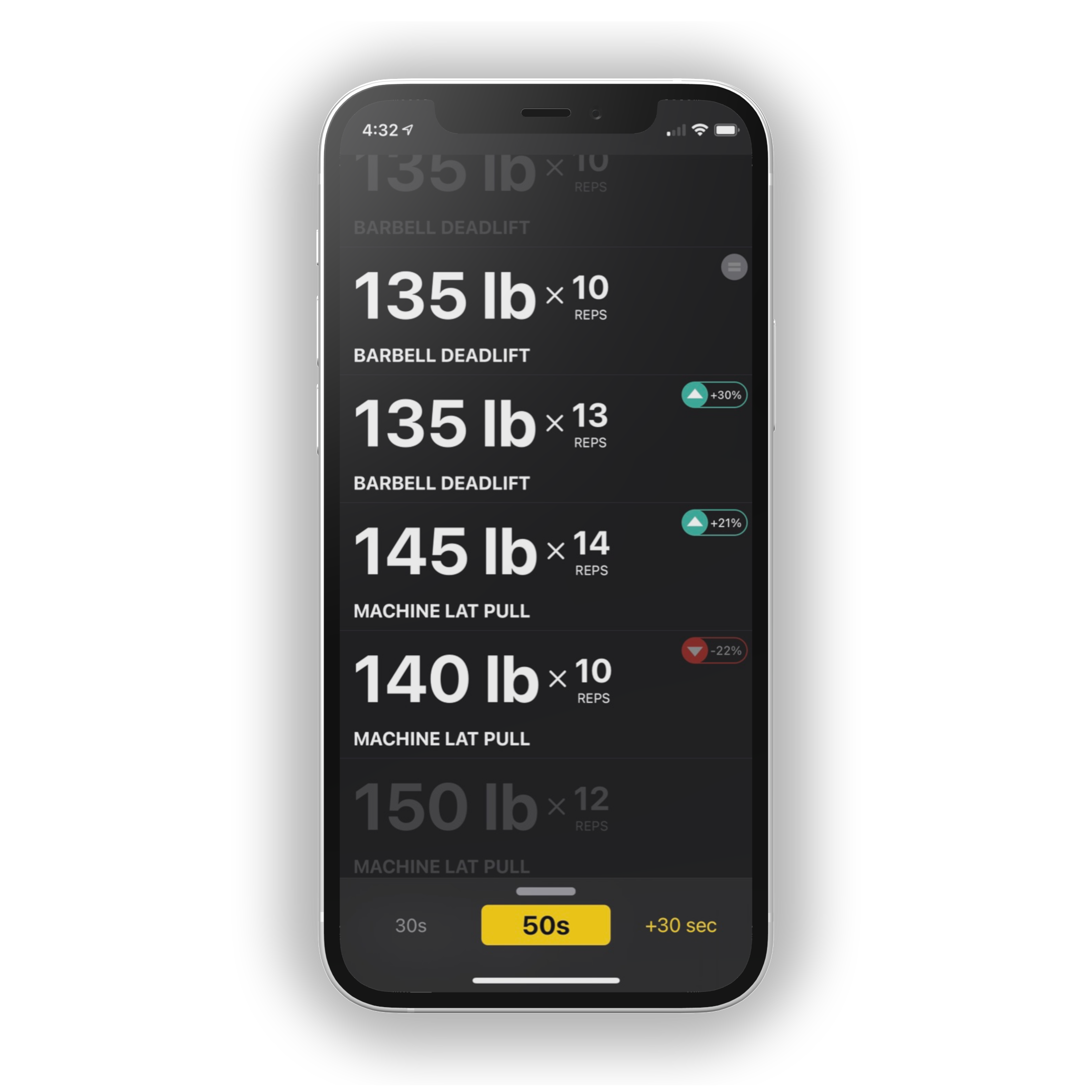
The interface on this screen is designed to be easily glanceable with large font sizes. Incomplete sets are displayed in a low contrast color with an algorithmically derived weight suggestion based on historical performance, and completed sets are presented with the the weight and reps clearly visible. Completed sets also receive a badge that indicates a performance difference based on the last time the user performed that set in this routine. Performance indicator badges are designed to promote continuous incremental improvement via progressive overload. The bottom panel displays overall elapsed workout time and a rest timer that the user can increase in 30 second increments with a satisfying physics animation that is enhanced with haptic feedback.
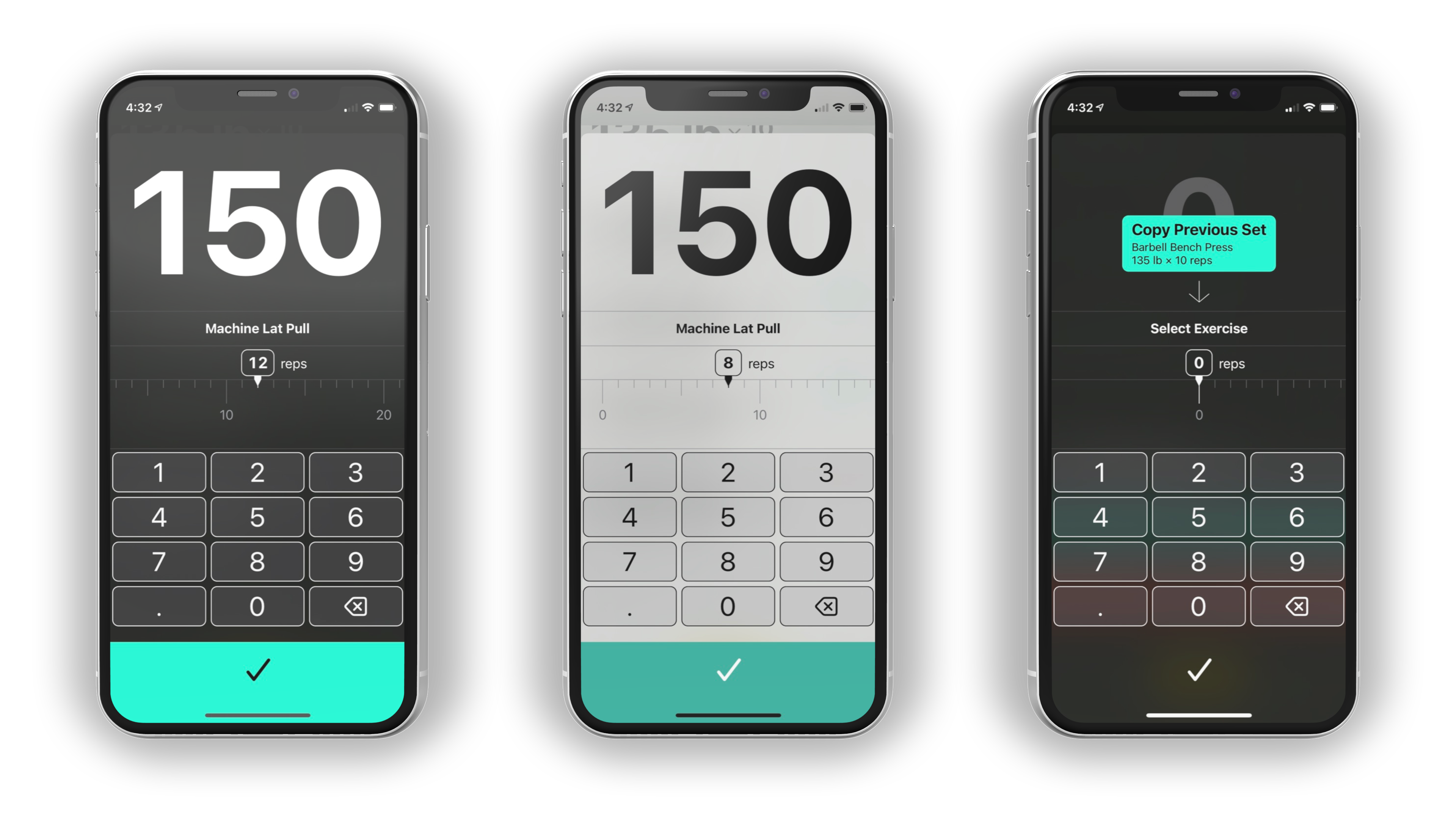
Recording a performed set is the most common interaction with the app. During a weightlifting workout it’s common for a user’s hands to be sweaty, dirty, or covered in chalk or grip lotion. The linear picker view for selecting the number of reps performed is designed to be easy to manipulate with a single swipe, and programmed to be forgiving when receiving accidental input from sweaty or dirty hands. The weight value is displayed in a large font and a generously sized keypad to enter the weight value. A keypad interface was chosen over a linear picker to allow for easy entry of fractional weight values, which would have required too many increments on a linear style picker.
When performing an unplanned workout or adding additional sets to a planned workout the user is presented with an option to duplicate the most recently recorded set. Typically the same exercise is performed back to back repeatedly so this solution saves the user from searching for a specific exercise each time.
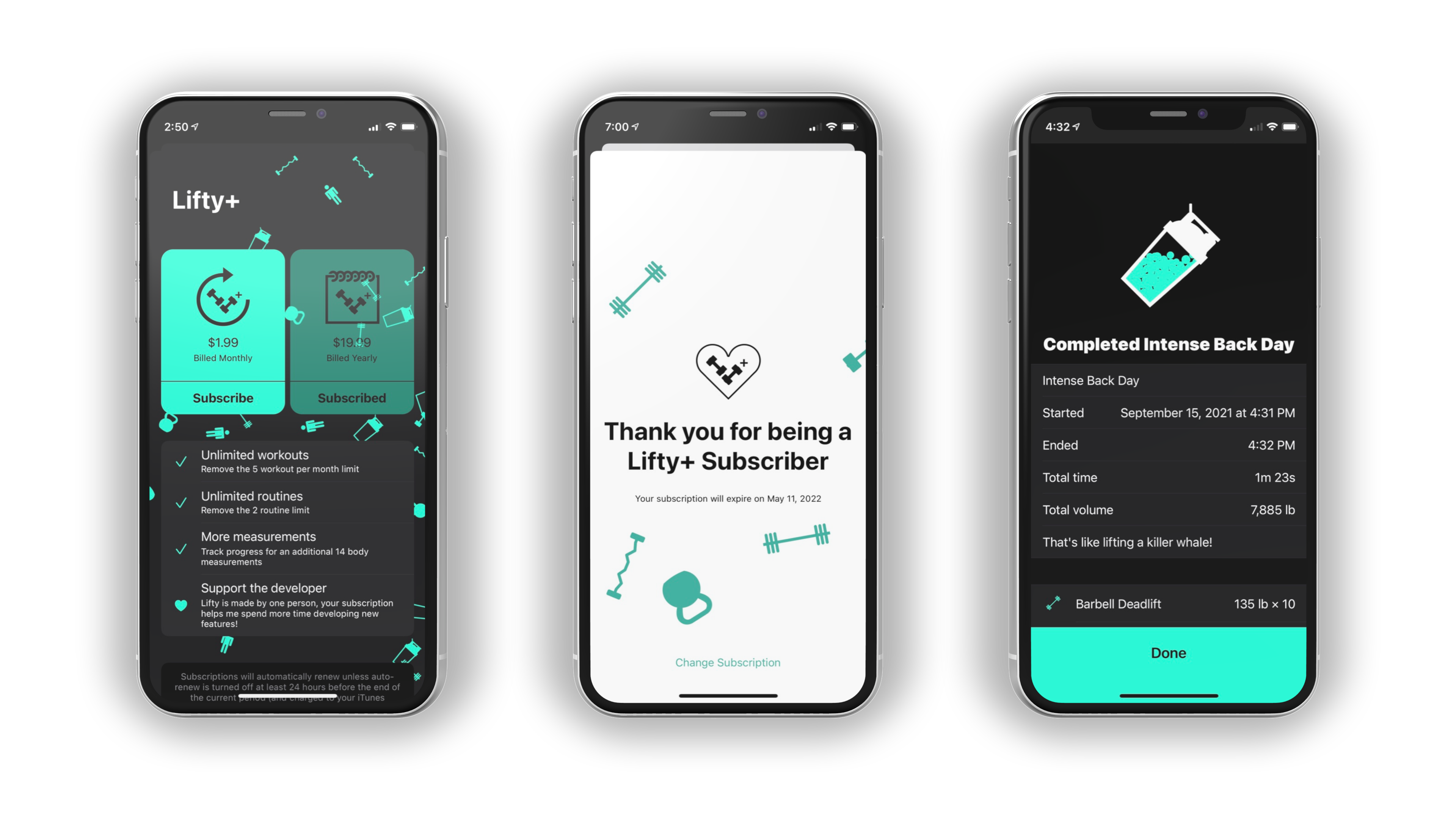
To contribute delight to the app, tasteful physics-based animations were added to key interactions. The Lifty+ sales screen uses a particle emitter displaying the icons for various equipment types slowly floating horizontally behind the content. The "thank you" screen for current subscribers shows the same equipment icons "jumping for joy" with a rigid body physics animation. When a user completes a workout they are treated to a workout summary screen that includes a physics simulation of a blender bottle style shaker cup filled with particles in a physics simulation and a fun shaking animation. Inquisitive users will find that tapping on the shaker cup will trigger a shake animation that is unique every time, and tilting or shaking their device will move the particles around in a lifelike manner. If the user was performing a pre-planned routine the number of particles in the cup will be more or less depending on the user's performance vs previous attempts at that same routine.
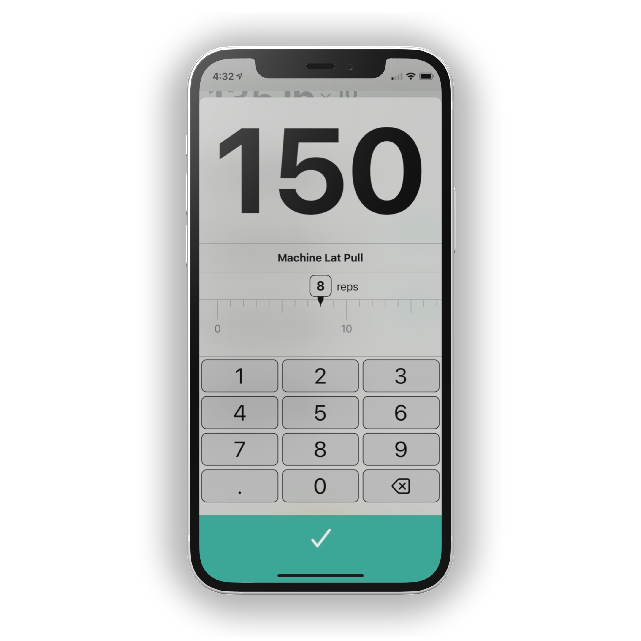
A custom picker control was designed for entering values along a linear scale. This picker serves a similar function to a slider, however it does not become more difficult to select a precise value when the total range of values increases or decreases. This custom picker view is also superior to embedding a standard vertically scrolling iOS UIPickerView because its horizontal interaction gestures will not collide with the vertical swipe gestures commonly used in a scrolling content view. Values move horizontally along a single axis and only the values near the currently selected value are visible, with configurable markers for significant value. In this example a significant value is displayed inside the picker tape every 10 units, with a slightly larger unlabeled callout value every 5 units, and the remaining units are presented as smaller ticks similar to a measuring tape. Haptic feedback is used to provide a satisfying feeling when scrolling along the values and the internal acceleration and deceleration events of the UIScrollView are intercepted to ensure that the picker always gracefully lands on a valid number designated by a tick mark.
This UI component is available as an open source project on GitHub for non-commercial use.